
Hillel Ontario Re-Brand
Hillel Ontario is a provincial organization dedicated to fostering Jewish life on nine university campuses. Affiliated with the world's largest Jewish student organization and the largest global, regional Hillel system, our mission is to enrich Jewish campus life across these nine universities, collectively serving over 15,000 Jewish students. Hillel Ontario takes pride in engaging, empowering, and inspiring more Jewish university and college students than any other initiative.
This commitment is evident in their promotion of Jewish identity through transformative trips and campus initiatives, cultivation of student leadership, and embrace of religious and political diversity within an inclusive environment.

Hillel Ontario sought a united identity that spotlights the organization, its campuses, and programs. The adaptable logo seamlessly fits across platforms. Rooted in the mission, the redesign embodies vibrant Jewish student community-building. It evolves the Hillel Ontario brand into something college students proudly associate with, reflecting their journey of growth and celebration amidst a changing world.
Central to this change is the unique wordmark—unassuming yet distinctive. Purposefully aligned with Hillel International's aesthetic, it harmoniously blends "Hillel" while distinctively highlighting "Ontario" and its associated campuses. This is more than a re-branding—it's a statement of identity poised to engage the vibrant college demographic we serve.


For our submark we created a 3D-shaped “H”, which originates from a single plane, which, when folded, generates many variants of its structural form. The 3D element of the shape represents growth and adaptability, relating to Hillel Ontario’s mission to “gather, celebrate, and develop the knowledge, skills, and confidence needed to thrive in a rapidly changing world.”
This element can be the starting point for a versatile visual language that can be rolled out across print and digital. This playfulness, together with the use of tactile materials, reflects a practice that’s moving into a new era with renewed confidence. The 3D “H” shape is designed to work as a symbol or icon, like on social channels and app icons and within the mobile experience. Both of these elements are supported by an evolved colour palette which moves away from a singular brand blue to a broader, distinctive set.


Our Process.
My colleague, Ashley Goldstein and I undertook an intensive 6-month project, engaging with student leaders, staff, board members, and consultants to shape our new brand identity. Throughout the process, we crafted hundreds of versions, each honing in on the direction that most authentically aligned with Hillel Ontario's mission and vision.
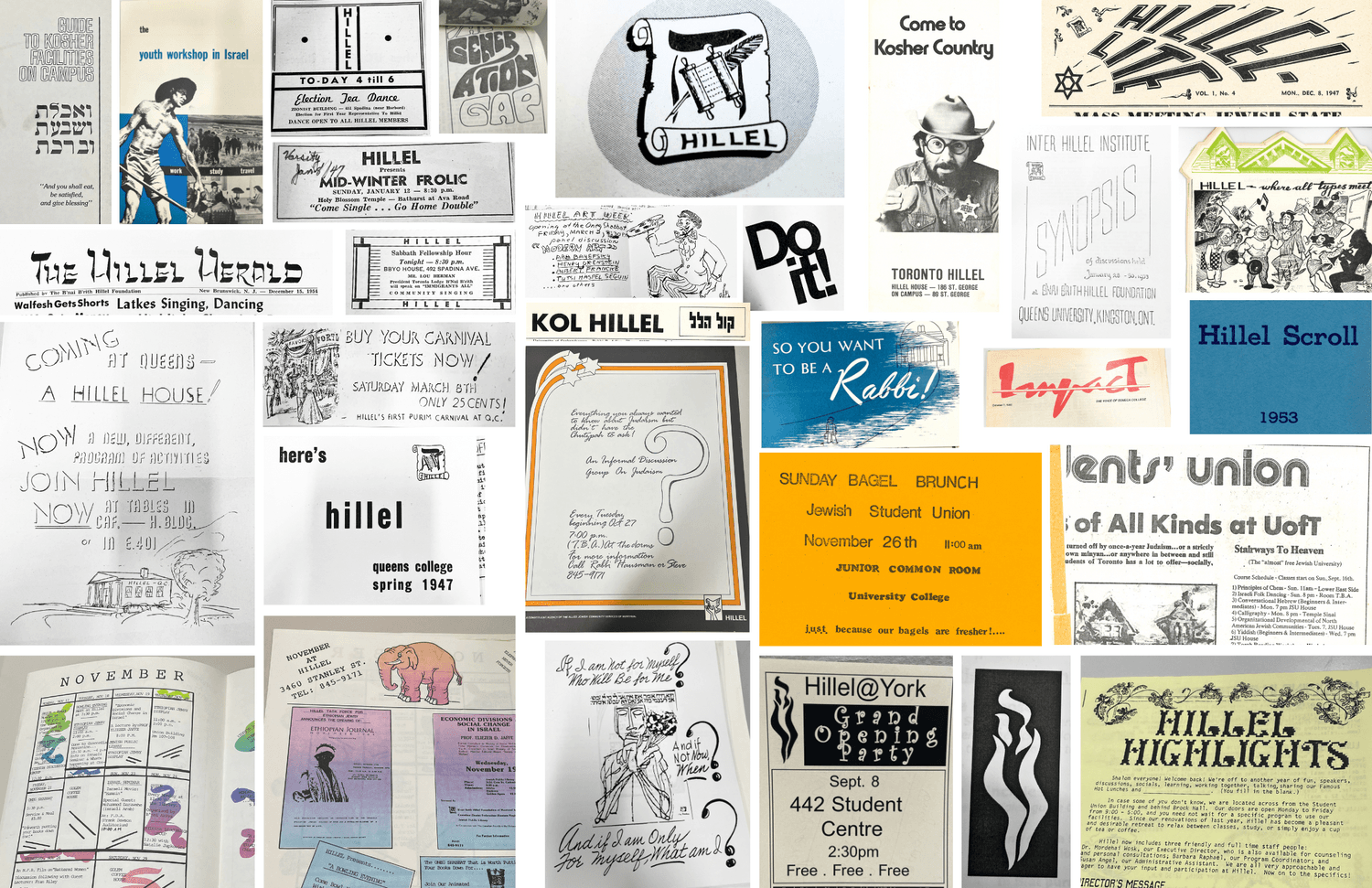
We discovered communication materials in the Ontario Jewish Archives that had a diverse range of typography, which perfectly matched our brand's stance. This mix of styles greatly influenced the creative choices we made for this redesign.


It was essential for campus branches to embrace their unique campus colours, as we understood that students wouldn't feel a sense of pride in wearing the brand otherwise. The colour and layout system was developed to ensure that Hillel campus logos consistently feature their specific colours when used in conjunction with black and white.


Hillel Ontario required a streamlined design system that could be easily utilized in-house by all our campus branches, primarily by our 50+ Hillel professionals and 200+ Student Leaders who are not professional designers. This entailed several considerations: the design system and layouts should be manageable through Canva, should maintain conceptual simplicity, and should be resistant to technical errors. The introduction of our "sHape" element elevates the dynamic design and structure of our layouts in a user-friendly, non-technical manner.


